 WEB程序开发笔记
WEB程序开发笔记
WEB程序开发笔记
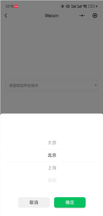
首先,在日常开发中下拉选择框select的需求会经常遇到,但是移动端最常见形式的就是底部弹出一个picker,而select更多见于 PC 端的 web 项目。
无论是select还是picker本质上都是从多个选项中选择其中一个,那么当用户还没有选择的时候,我们希望它能显示友好的提示文案,比如“请选择xxxx”,对于select我们使用placeholder属性就可以轻松实现,但是微信官方的picker组件本身没有placeholder属性,在原生微信小程序开发中我们又不希望引入其他 UI 库,或者第三方组件,此时我们自己动手封装一个组件是最佳方式。
Input 伪装法的原理就是用一个禁用的Input来模拟picker的显示区域,点击输入框时,弹出picker。
这种方法利用了input自带的placeholder属性,当input的值不为空时,自动隐藏placeholder,满足需求,并且在表单场景下能获得更好的样式统一性。
components
    |—— input-mock-picker
            |—— index.js
            |—— index.json
            |—— index.wxml
            |—— index.wxss
Component({
  properties: {
    value: {  // options 中选中的项目的 value
      type: String,
    },
    options: { // 选项列表:[ { value: 1, label: '太原' }, { value: 2, label: '北京', } ]
      type: Array,
      value: []
    },
    color: { // input 文字颜色
      type: String,
      value: '#000'
    },
    placeholder: { // placeholder 文字内容
      type: String,
      value: '请选择'
    },
    placeholderColor: { // placeholder 文字颜色
      type: String,
      value: '#808080'
    }
  },

  data: {
    selectedIndex: '', // 选中项的索引值
    arrowRotate: false, // 控制右侧小箭头的动画效果
  },

  lifetimes: {
    attached() {
      this.handleExternalValue();
    },
    detached() {
      this.data.selectedIndex = '';
    }
  },

  methods: {

    // 渲染初始值
    handleExternalValue() {
      console.log(this.properties)
      if (!this.properties.options.length || !this.properties.value) return;

      const index = this.properties.options.findIndex((item) => item.value == this.properties.value);
      if (index != -1) this.setData({
        selectedIndex: index
      });
    },

    onPickerTap() {
      this.setData({ arrowRotate: true });
    },

    onPickerCancel() {
      this.setData({ arrowRotate: false });
    },

    // 监听 picker 确认事件
    bindPickerChange(e) {
      const selectedIndex = e.detail.value;
      const index = this.properties.options.findIndex((_, _index) => _index == selectedIndex);
      if (index == -1) return;
      this.setData({
        selectedIndex: index,
        arrowRotate: false,
      });

      const selected = this.properties.options.find((_, _index) => _index == selectedIndex)
      if (selected !== undefined) {
        this.triggerEvent('change', {
          value: selected.value
        });
      }
    }
  }
});
{
  "component": true,
  "usingComponents": {}
}
<picker
  mode="selector"
  range="{{options}}"
  value="{{selectedIndex}}"
  range-key="label"
  bindtap="onPickerTap"
  bindcancel="onPickerCancel"
  bindchange="bindPickerChange">
  <view class="picker-container">
    <!-- 用一个禁用的输入框来显示内容 -->
    <input
      class="picker-input"
      value="{{selectedIndex !== '' ? options[selectedIndex].label : ''}}"
      disabled="true"
      placeholder="{{placeholder}}"
      placeholder-style="color: {{placeholderColor}}"
      style="color: {{color}}"
    />
    <!-- 使用实体字符箭头,Unicode ▼ 或 ▾ -->
    <text class="arrow-icon {{arrowRotate ? 'rotate' : ''}}">▾</text>
  </view>
</picker>
.picker-container {
  display: flex;
  align-items: center;
  position: relative;
}

.picker-input {
  flex: 1;
  height: 80rpx;
  padding: 0 24rpx;
  border: 2rpx solid #e0e0e0;
  border-radius: 8rpx;
  font-size: 28rpx;
  box-sizing: border-box;
}

.picker-placeholder {
}

/* 箭头样式 */
.arrow-icon {
  position: absolute;
  right: 10rpx;
  display: inline-block;
  font-size: 42rpx;
  color: #999;
  transition: transform 0.3s cubic-bezier(0.4, 0.0, 0.2, 1); /* 更平滑的曲线 */
  margin-left: 10rpx;
  line-height: 1;
}

.arrow-icon.rotate {
  transform: rotate(180deg);
}
以 页面 page1 为例,下面给出使用组件的代码片段。
在 page1.json 文件中引入组件:
{
  "usingComponents": {
    "InputMockPicker": "/components/input-mock-picker/index"
  }
}
在 page1.js 中增加相关data属性和方法:
Page({
    data: {
        recordType: '',
        recordTypeEnum: [ { value: 1, label: '太原' }, { value: 2, label: '北京', } ],
    },
    methods: {
        bindRecordTypeSelectChange(e) {
          this.setData({ recordType: e.detail.value });
        },
    }
})
在 page1.wxml 中使用组件:
<InputMockPicker value="{{recordType}}" options="{{recordTypeEnum}}" placeholder="请选择记录类型" style="flex: 1" bindchange="bindRecordTypeSelectChange" />
🔥BuildAdmin是一个永久免费开源,无需授权即可商业使用,且使用了流行技术栈快速创建商业级后台管理系统。