WEB程序开发笔记
WEB程序开发笔记
WEB程序开发笔记
Lucide 是一款广受欢迎的开源图标库,它拥有超过 1600 枚精心设计的矢量(SVG)图标,能够轻松适配从网页、应用到印刷品等多种场景。该库的核心优势在于,它为开发者提供了覆盖主流技术栈的官方包,极大地简化了图标集成的复杂度。
目前,Lucide 已支持包括 Vanilla JavaScript、React、React Native、Vue、Svelte、Preact、Solid、Angular、Astro 以及静态站点生成器在内的众多平台。无论你使用哪种技术,都能找到对应的 Lucide 包,实现无缝集成。
官方网站:lucide.dev
图标预览:lucide.dev/icons
本文将聚焦于 Vue 3 生态,带你一步步掌握 Lucide 的核心用法与最佳实践
Lucide 为 Vue 开发者准备了一套官方的图标组件库,让图标集成变得简单直接。每一个图标都是一个独立的 Vue 组件,您既可以在模板中使用,也能在 JSX 中随意调用。
它拥有几个非常实用的特性:
零成本体验:导入即用,组件化调用,无需任何额外配置。
随心定制:通过 props 控制大小、颜色等,满足各种视觉需求。
体积无忧:得益于 Tree-shaking,只有您用到的图标才会进入最终打包文件。
TypeScript 支持:完全基于 TypeScript 编写,智能提示随手可得,编码体验更顺畅。
在 Vue 项目中安装 Lucide 图标库。
pnpm add @lucide/vue

yarn add @lucide/vue

npm install @lucide/vue
开始使用 Lucide 非常简单。
每个图标都可以作为 Vue 组件导入,该组件会渲染一个内联 SVG 元素。这样,只有导入到项目中的图标才会被包含在最终的打包文件中。
在 Vue 3 中,你只需要像导入一个普通组件一样导入图标即可。例如,添加一个相机图标:
<script setup>
import { Camera } from "@lucide/vue";
</script>

<template>
  <Camera />
</template>
由于图标以 SVG 元素的形式渲染,因此所有标准的 SVG 属性均可作为属性应用。请参阅 MDN 上的 SVG 呈现属性列表。
要自定义图标的外观,可以使用以下属性:
| 属性名称 | 数据类型 | 默认值 |
|---|---|---|
| size | number | 24 |
| color | string | currentColor |
| stroke-width | number | 2 |
| absoluteStrokeWidth | boolean | false |
| default-class | string | lucide-icon |
Props 应用示例:
<template>
  <Camera :size="48" color="red" :stroke-width="1" />
</template>
默认情况下,所有图标的大小均为 24px × 24px。可以通过 sizeprop 和 CSS 调整该大小。
设置图标大小方式如下:
<script setup>
import { Landmark } from "@lucide/vue";
</script>

<template>
  <Landmark :size="64" />
</template>
<script setup>
import { Beer } from "@lucide/vue";
</script>

<template>
  <Beer class="my-beer-icon" />
</template>

<style scoped>
.my-beer-icon {
  width: 64px;
  height: 64px;
}
</style>
<script setup>
import { Star } from "@lucide/vue";
</script>

<template>
  <div className="text-wrapper">
    <Star class="my-icon" />
    <div>Yes</div>
  </div>
</template>

<style scoped>
.my-icon {
  /* 图标大小将根据 .text-wrapper 的字体大小进行调整 */
  width: 1em;
  height: 1em;
}

.text-wrapper {
  font-size: 96px;
  display: flex;
  gap: 0.25em;
  align-items: center;
}
</style>
<script setup>
import { PartyPopper } from "@lucide/vue";
</script>

<template>
  <div>
    <PartyPopper class="size-24" />
  </div>
</template>
默认情况下,所有图标的颜色值均为:currentColor。该关键字使用元素的计算后的文本颜色值来表示图标的颜色。
如果 currentcolor 用于 color 属性的值,则它将从 color 属性的继承值中获取其值。
设置图标颜色方式如下:
<script setup>
import { Smile } from "@lucide/vue";
</script>

<template>
  <Smile color="#3e9392" />
</template>
<script setup>
import { ThumbsUp } from "@lucide/vue";
</script>

<template>
  <button :style="{ color: '#fff' }">
    <ThumbsUp />
    Like
  </button>
</template>
默认情况下,所有图标的描边宽度均为 2px。可以通过 stroke-width 属性(Props)调整该值。
设置图标描边宽度方式如下:
<script setup>
import { FolderLock } from "@lucide/vue";
</script>

<template>
  <FolderLock :strokeWidth="2" />
</template>
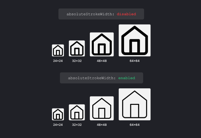
调整 size 属性时,描边宽度会随图标大小而变化,这是 SVG 的默认行为。引入 absoluteStrokeWidth 属性正是为了调整这一行为,使描边宽度无论图标大小如何都保持恒定。
这意味着,当启用 absoluteStrokeWidth 且图标大小设置为 48px 时,屏幕上的描边宽度仍为 2px。
<script setup>
import { RollerCoaster } from "@lucide/vue";
</script>

<template>
  <RollerCoaster :size="96" absoluteStrokeWidth />
</template>
@lucide/vue 包中导出的类型列表。在 TypeScript Vue 项目中使用 Lucide 图标时,可利用这些类型为组件进行类型声明。
导出所有可传递给图标组件的属性以及任何其他 SVG 属性,参见:MDN 上的“SVG 呈现属性”。
interface LucideProps {
  size?: number | string;
  color?: string;
  strokeWidth?: number;
  absoluteStrokeWidth?: boolean;
  [key: string]: any; // Any other SVG attributes
}
可以使用 LucideProps 接口为自定义图标组件定义属性。比如我们下面自定义了一个 IconWrapper.vue 组件:
<script lang="ts" setup>
import { type LucideProps } from "@lucide/vue";
import { Camera } from "@lucide/vue";

defineProps<LucideProps>();
</script>

<template>
  <div>
    <Camera v-bind="$props" />
  </div>
</template>
官方不支持填充功能。不过,所有图标均支持所有 SVG 属性。填充功能仍可使用,并在某些图标上能正常显示。
下面以星星为例:
<script setup>
import { Star, StarHalf } from "@lucide/vue";
</script>

<template>
  <div class="app">
    <div class="star-rating">
      <div class="stars">
        <Star v-for="i in 5" fill="#ccc" strokeWidth="0" />
      </div>
      <div class="stars rating">
        <Star fill="#e6f700" strokeWidth="0" />
        <Star fill="#e6f700" strokeWidth="0" />
        <StarHalf fill="#e6f700" strokeWidth="0" />
      </div>
    </div>
  </div>
</template>

<style scoped>
.star-rating {
  position: relative;
}

.stars {
  display: flex;
  gap: 4px;
}

.rating {
  position: absolute;
  top: 0;
}
</style>
可以通过嵌套 SVG 元素将多个图标合并为一个图标。
<script setup>
import { Scan, User } from "@lucide/vue";
</script>

<template>
  <div class="app">
    <Scan :size="48">
      <User :size="12" x="6" y="6" absoluteStrokeWidth />
    </Scan>
  </div>
</template>
还可以将 Lucide 图标与原生 SVG 元素结合使用,以创建自定义图标变体。
例如,您可以使用圆形 SVG 元素为图标添加通知徽章。
<script setup>
import { ref, onMounted } from "vue";
import { Mail } from "@lucide/vue";
let hasUnreadMessages = ref(true);

onMounted(() => {
  setTimeout(() => {
    hasUnreadMessages.value = false;
  }, 3000);
});
</script>

<template>
  <Mail :size="48">
    <circle
      v-if="hasUnreadMessages"
      r="3"
      cx="21"
      cy="5"
      stroke="none"
      fill="#F56565"
    />
  </Mail>
</template>
还可以使用 SVG 的 text 元素在图标中添加文本。
<script setup>
import { File } from "@lucide/vue";
</script>

<template>
  <File :size="48">
    <text
      x="7.5"
      y="19"
      font-size="8"
      font-family="Verdana,sans-serif"
      :stroke-width="1"
    >
      JS
    </text>
  </File>
</template>
Lucide 用下来感觉挺顺手的,图标够用、体积也小,Vue 里的集成方式也不复杂,基本没什么学习成本。希望这篇分享对你有帮助,如果也在找 Vue 项目用的图标库,可以试试看。
 强烈推荐的PHP全栈开发后台管理系统

🔥BuildAdmin是一个永久免费开源,无需授权即可商业使用,且使用了流行技术栈快速创建商业级后台管理系统。